Embed the Transparency Center
You can embed the full Transparency Center — or individual sections like consent management or rights request forms — directly into your application as web components. This keeps data subjects on your platform and provides a seamless experience.
The components are self-contained custom elements that work with any HTML page regardless of framework. They handle styling, responsiveness, and interactivity independently.
Prerequisites
- A published Transparency Center in your Dxtra workspace (see setup guide)
- Your Data Controller ID (found in the Dxtra dashboard under Home — displayed as the "Data Controller DID")
- Access to your application's HTML or frontend codebase
Add the script
Include the Dxtra Transparency Center script in your page's <head> or before the closing </body> tag:
This loads all Transparency Center web components. The script is loaded as an ES module and does not block page rendering.
Available components
Dxtra provides a full Transparency Center component and several standalone section components:
| Component | Description |
|---|---|
<transparency-center> | The full Transparency Center with all sections and navigation |
<dx-overview> | Overview dashboard with summary tiles |
<dx-consents> | Consent management — data subjects view and update consent preferences |
<dx-rights-management> | Rights request form and request history |
<dx-privacy> | Privacy notices in all four formats (Labels, Overview, Comprehensive, Cookie) |
<dx-data-map> | Data mapping visualization showing identifiers and processors |
All components require the data-controller-id attribute set to your Data Controller ID.
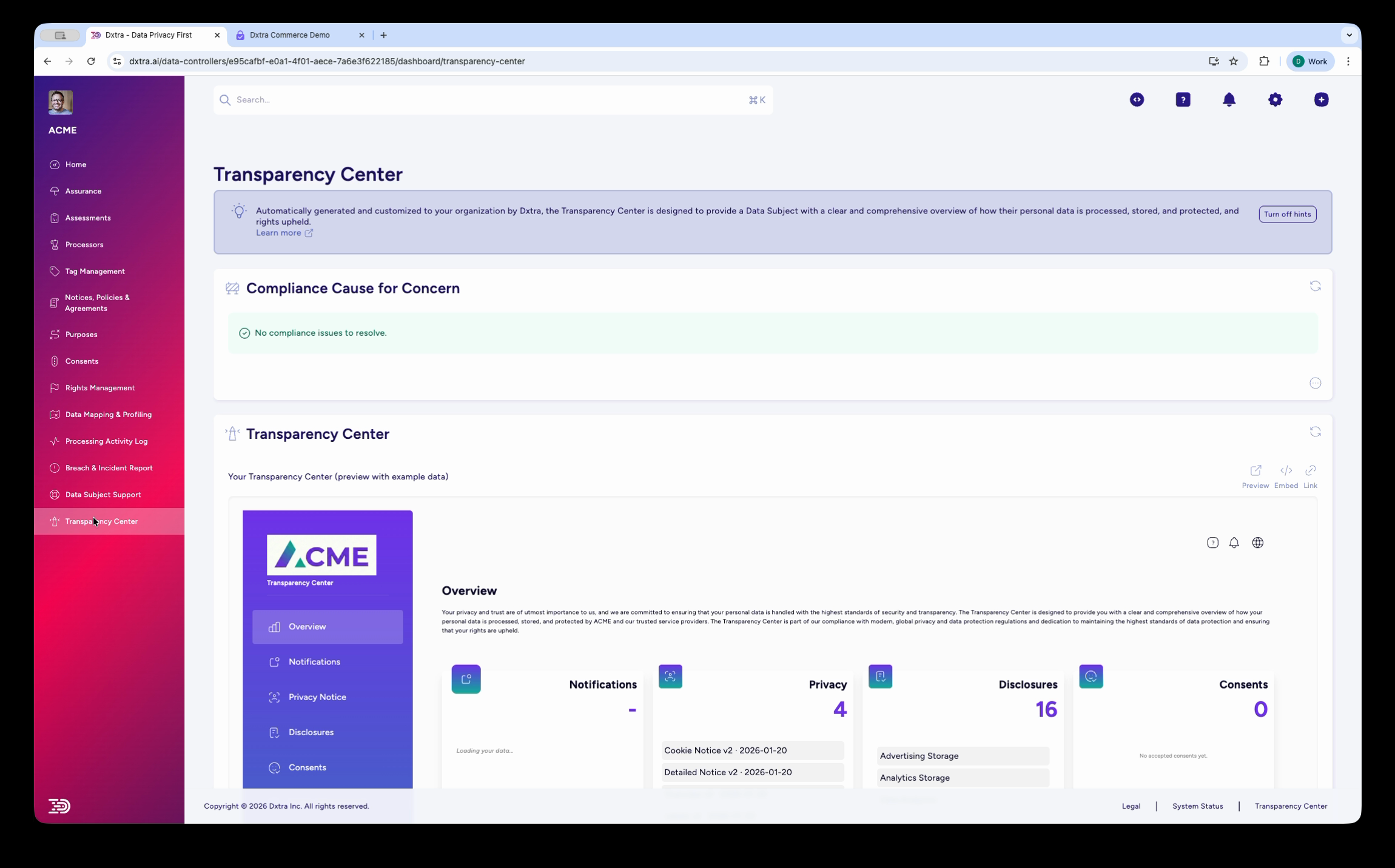
Full Transparency Center
Embed the complete portal with navigation, all sections, and data subject authentication:
<transparency-center
  data-controller-id="YOUR_DATA_CONTROLLER_ID"
  color-theme="light"
></transparency-center>
Replace YOUR_DATA_CONTROLLER_ID with your actual Data Controller DID (e.g. did:dep:a1b2c3d4-...).
Configuration attributes
| Attribute | Type | Default | Description |
|---|---|---|---|
data-controller-id | string | required | Your Data Controller DID from the Dxtra dashboard |
color-theme | light | dark | light | Color scheme for the component |
language | string | en | Language code (e.g. en, de, ja, fr) |
height | string | auto | Container height (any CSS value) |
width | string | 100% | Container width (any CSS value) |
Standalone components
Use individual components when you want to embed specific functionality without the full portal. For example, embed just the consent management component on a preferences page, or the rights request form on a support page.
Consent management
Displays the data subject's consent status with toggle controls for each consent purpose and preference category. Data subjects can opt in or out of individual items (e.g. Advertising Personalization, Analytics Cookies, Targeted Marketing).
Rights request form
Displays the request history table (with status badges: Pending, Verified, Complete) and a form to submit new requests. Request types include Data Portability, Rectification, Erasure, Object, and General Requests.
Privacy notices
Renders privacy notices with tabbed navigation between Privacy Labels, Privacy Overview, Privacy Notice (Comprehensive), and Cookie & Tracking Technologies Notice.
Overview dashboard
Displays summary tiles for notifications, privacy documents, disclosures, consents, rights requests, and privacy signals.
Data mapping
Displays detected personal data identifiers with colored processor icons showing which processors handle each identifier type.
Framework integration
React
Web components work in React, but custom element attributes are passed as properties. Use ref to set attributes if needed, or pass them directly in JSX:
import { useEffect, useRef } from 'react';

function PrivacyPage() {
  const ref = useRef(null);

  useEffect(() => {
    // Load the script dynamically if not already in <head>
    const script = document.createElement('script');
    script.src = 'https://transparencycenter.dxtra.ai/assets/index.js';
    script.type = 'module';
    document.head.appendChild(script);
  }, []);

  return (
    <div className="privacy-container">
      <h1>Our Privacy Practices</h1>
      <transparency-center
        ref={ref}
        data-controller-id="YOUR_DATA_CONTROLLER_ID"
        color-theme="light"
      />
    </div>
  );
}

export default PrivacyPage;
Next.js
The Transparency Center component requires client-side rendering. Use next/dynamic with ssr: false or a useEffect hook to load the script only in the browser:
'use client';

import { useEffect } from 'react';

export default function PrivacyPage() {
  useEffect(() => {
    const script = document.createElement('script');
    script.src = 'https://transparencycenter.dxtra.ai/assets/index.js';
    script.type = 'module';
    document.head.appendChild(script);

    return () => {
      document.head.removeChild(script);
    };
  }, []);

  return (
    <main>
      <h1>Privacy & Transparency</h1>
      <transparency-center
        data-controller-id="YOUR_DATA_CONTROLLER_ID"
        color-theme="light"
      />
    </main>
  );
}
Warning
Do not import or render the <transparency-center> component during server-side rendering. The component relies on browser APIs and must be loaded client-side only.
Vue
<template>
  <div>
    <h1>Our Privacy Practices</h1>
    <transparency-center
      :data-controller-id="controllerId"
      color-theme="light"
    />
  </div>
</template>

<script setup>
import { onMounted, ref } from 'vue';

const controllerId = ref('YOUR_DATA_CONTROLLER_ID');

onMounted(() => {
  const script = document.createElement('script');
  script.src = 'https://transparencycenter.dxtra.ai/assets/index.js';
  script.type = 'module';
  document.head.appendChild(script);
});
</script>
Tip
If Vue warns about unknown custom elements, add transparency-center and the dx-* components to the compilerOptions.isCustomElement config in your vite.config.js or vue.config.js.
Angular
Register the custom elements schema in your module, then use the component in templates:
// app.module.ts
import { NgModule, CUSTOM_ELEMENTS_SCHEMA } from '@angular/core';

@NgModule({
  schemas: [CUSTOM_ELEMENTS_SCHEMA],
  // ...
})
export class AppModule { }
// privacy.component.ts
import { Component, OnInit } from '@angular/core';

@Component({
  selector: 'app-privacy',
  template: `
    <h1>Our Privacy Practices</h1>
    <transparency-center
      [attr.data-controller-id]="controllerId"
      color-theme="light"
    ></transparency-center>
  `
})
export class PrivacyComponent implements OnInit {
  controllerId = 'YOUR_DATA_CONTROLLER_ID';

  ngOnInit() {
    const script = document.createElement('script');
    script.src = 'https://transparencycenter.dxtra.ai/assets/index.js';
    script.type = 'module';
    document.head.appendChild(script);
  }
}
WordPress
Add the script tag to your theme's header.php or use a plugin that allows adding scripts to the <head>:
<!-- In header.php or via a script injection plugin -->
<script src="https://transparencycenter.dxtra.ai/assets/index.js" type="module"></script>
Then add the component to any page or post using a Custom HTML block:
<transparency-center
  data-controller-id="YOUR_DATA_CONTROLLER_ID"
  color-theme="light"
></transparency-center>
Shopify
In your Shopify theme, add the script to theme.liquid before </head>:
Then add the component to a dedicated page template or section. For the footer privacy link, link directly to your hosted Transparency Center URL.
Styling
CSS custom properties
Override default colors and fonts by setting CSS custom properties on the component:
transparency-center {
  --primary-color: #2563eb;
  --secondary-color: #475569;
  --font-family: 'Inter', -apple-system, sans-serif;
  --border-radius: 8px;
}
These properties also work on standalone components (dx-consents, dx-rights-management, etc.).
Container styling
Add a class attribute to style the component's container:
<transparency-center
  data-controller-id="YOUR_DATA_CONTROLLER_ID"
  class="tc-container"
></transparency-center>
.tc-container {
  max-width: 1200px;
  margin: 0 auto;
  border: 1px solid #e5e7eb;
  border-radius: 8px;
}
Dark mode
Set color-theme="dark" for a dark background variant:
<transparency-center
  data-controller-id="YOUR_DATA_CONTROLLER_ID"
  color-theme="dark"
></transparency-center>
Responsive behavior
The components automatically adapt to the viewport:
- Desktop (1200px+) — Multi-column layout with sidebar navigation
- Tablet (768px) — Single-column layout with tab navigation
- Mobile (375px) — Stacked layout with accordion sections
No additional configuration is needed for responsive behavior.
Troubleshooting
Component does not render
- Verify the script tag is loaded: check the browser console for 404 or CORS errors
- Confirm
data-controller-idis correct — copy it from the Dxtra dashboard (Home > Data Controller DID) - Ensure the Transparency Center is published (complete the setup guide)
- Check that JavaScript is enabled and ES modules are supported by the browser
Styling conflicts
- The component uses Shadow DOM for style isolation, but parent page styles (especially CSS resets) may affect the container element
- Use CSS custom properties to override component colors rather than targeting internal elements
- If the component appears too narrow or cropped, check that the parent container has sufficient width
Authentication issues
- Data subjects authenticate via magic link email. If the magic link flow is not working, verify your domain configuration in Organization > Domain Management
- Magic link emails are sent from
no-reply@dxtra.ai— ensure this is not blocked by email filters
Performance
- The script is loaded as an ES module with lazy loading — it does not block page rendering
- Subsequent visits use the browser cache
Browser support
The Transparency Center web components are supported in:
- Chrome / Edge 90+
- Firefox 88+
- Safari 14+
- iOS Safari 14+
- Android Chrome 90+
Next: Learn how to customize the appearance of the Transparency Center to match your brand.